Synas logo usage guidelines
The Synas logo, wordmark, and symbol are important expressions of our brand identity. These few simple rules will help you use our logo, wordmark, and symbol to communicate the Synas brand most effectively.
The Synas logo
This is the Synas logo. It is our primary graphic device and should be the first choice when choosing a graphic element to represent the Synas brand.
Logo clearspace and margins
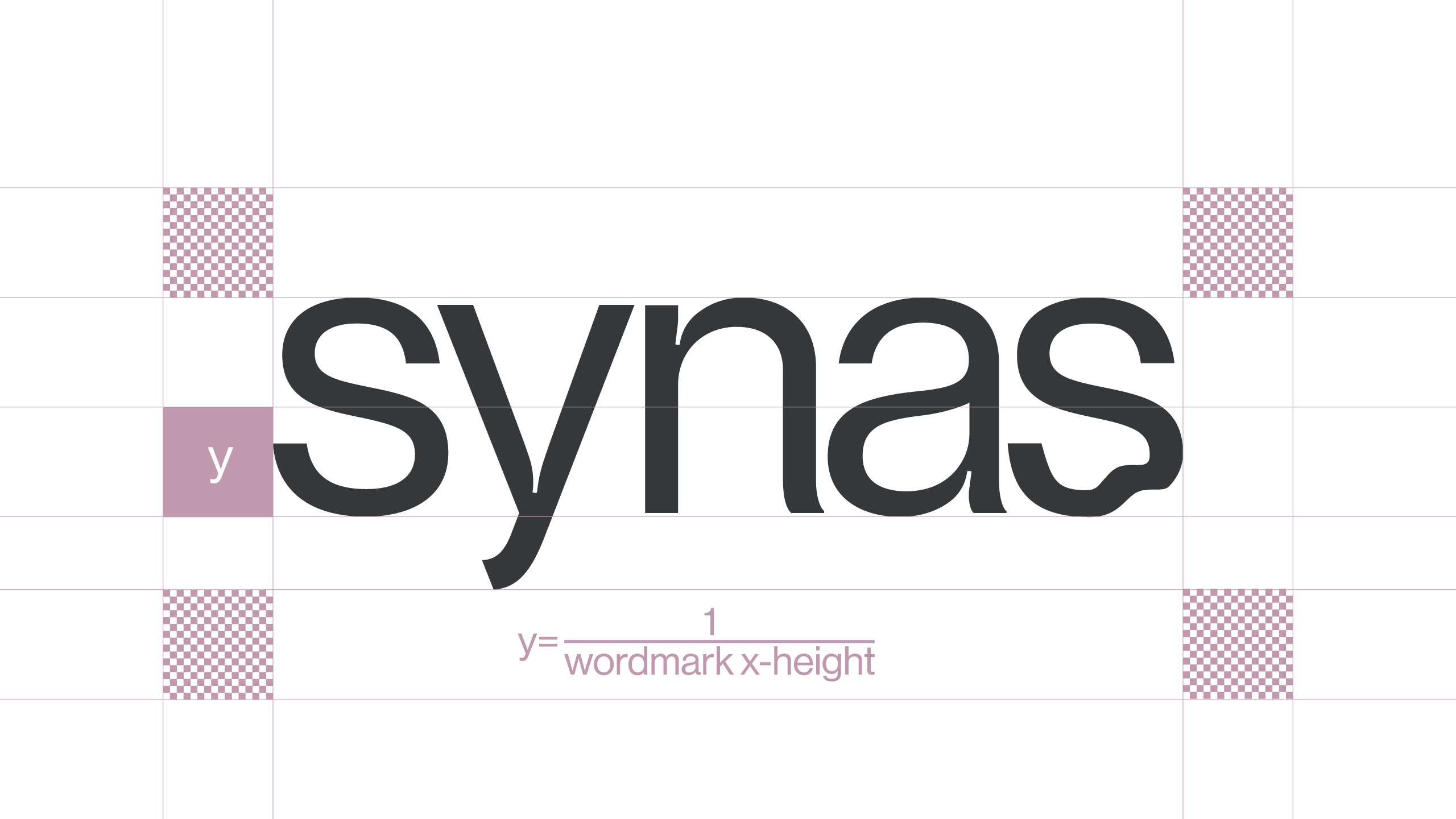
When using the logo in a design or placing it next to other visual elements, you should ensure that it has plenty of room to breathe. This is where clearspace and margins come in to play.
Logo + color
Our color logo combinations
 |
 |
 |
 |
|
|
|
|
Color palette
Our color palette
|
Synas Pink Hex |
|||
|
Lilac Hex |
Opal Hex |
Coral Hex |
Onyx Hex |
Symbol
This is the Synas symbol. The symbol can be used on its own in certain, very specific situations when the context and association with Synas is clearly established and controlled
 |
 |
 |
 |
 |
 |
Thank you!
If you are having trouble with anything in this guide, you are missing brand elements from the brand package, or you are unsure if your communication best represents the Synas brand, please contact us.
Need help?
Every company, regardless of size or age in the market, needs a logo that will help define their brand and identify who they are to customers. Contact us if you need help with your brand!